
Bars
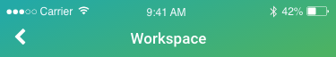
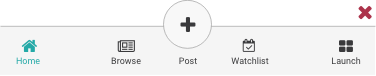
Status and Navigation Bars

Zoomed View

Options


Tab Bar
Action Buttons
Enabled: Subtle Black #3a3a3c
Enabled-Tapped: Subtle Black #3a3a3c, 50% Opacity
Active: Jade #4db364
Active-Tapped: Jade #4db364, 50% Opacity
Disabled: Inactive Grey #cccccc
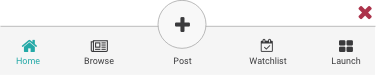
Tab Bar Design Example
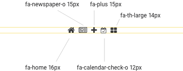
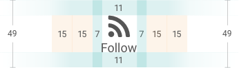
The icons and their labels on the Tab Bar need to be spaced by eye rather than by a mathematical equation. This is to ensure that the white space between each icon and label looks visually similar.

Unfortunately, Font Awesome icons vary in size. Therefore each icon requires consideration of its height and width to ensure, when put together, all icons look similar.
Correct
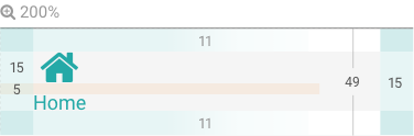
The white space between the icons and their labels is visually similar.

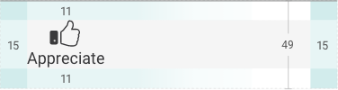
Zoomed View
Incorrect
This example demonstrates that evenly distributing the icons and their labels results in the Post button being un-centred.
Incorrect
The Post button is centered but the other labels and icons are randomly distributed resulting in uneven areas of white space.
Post Icon Open View

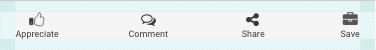
Tool Bars
Insight Longform
Action Buttons
Enabled: Subtle Black #3a3a3c
Enabled-Tapped: Subtle Black #3a3a3c, 50% Opacity
Active: Jade #4db364
Active-Tapped: Jade #4db364, 50% Opacity
Disabled: Inactive Grey #cccccc
Zoomed View
Enabled

Appreciated by Others
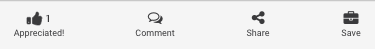
Appreciated by Me

On Insight Snippet
Action Buttons
Enabled: Subtle Black #3a3a3c
Enabled-Tapped: Subtle Black #3a3a3c, 50% Opacity
Active: Jade #4db364
Active-Tapped: Jade #4db364, 50% Opacity
Disabled: Inactive Grey #cccccc


